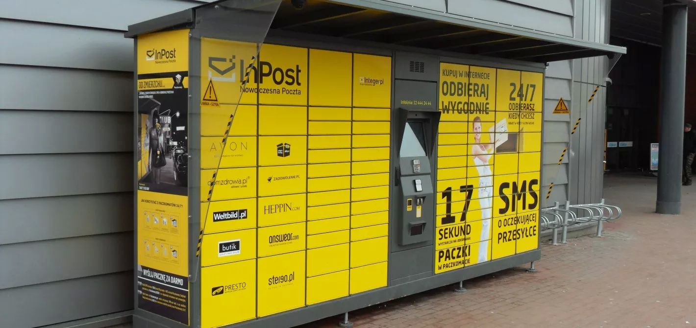
Yesterday I've sent my first parcel via the self-serving post boxes and it got me thinking.

I'm not new to these boxes, but not as a sender - previously I received plenty of parcels there and it is very easy to get one. You just come to the box, tap 'Receive', enter your phone number, door opens, you take the contents and close the door. That's it.
But I was always unsure about sending anything through it, because it felt like it should be much harder to do that unlike receiving. And boy I was wrong 🙂 You just print out a shipping label, stick it onto the box, come to the post boxes, tap 'Start', scan the barcode, door opens, you put the box inside, close the door and you're done! How crazy is that?
You might wonder, why the topic is about UX? Because in both cases my user-flow and user experience was short, clear and seamless. With few taps I can both send or receive a parcel within a country, and this is the new norm, the new baseline. Any new shipping service should have that by default, and probably make the process even more streamlined. Which in this case already sounds hard to do, only if the next shipping company would save your travel time to the post box and would actually deliver and take boxes from your porch with drones 🙂