Author 53 Posts
Igor Zharii

Igor Zharii

Website

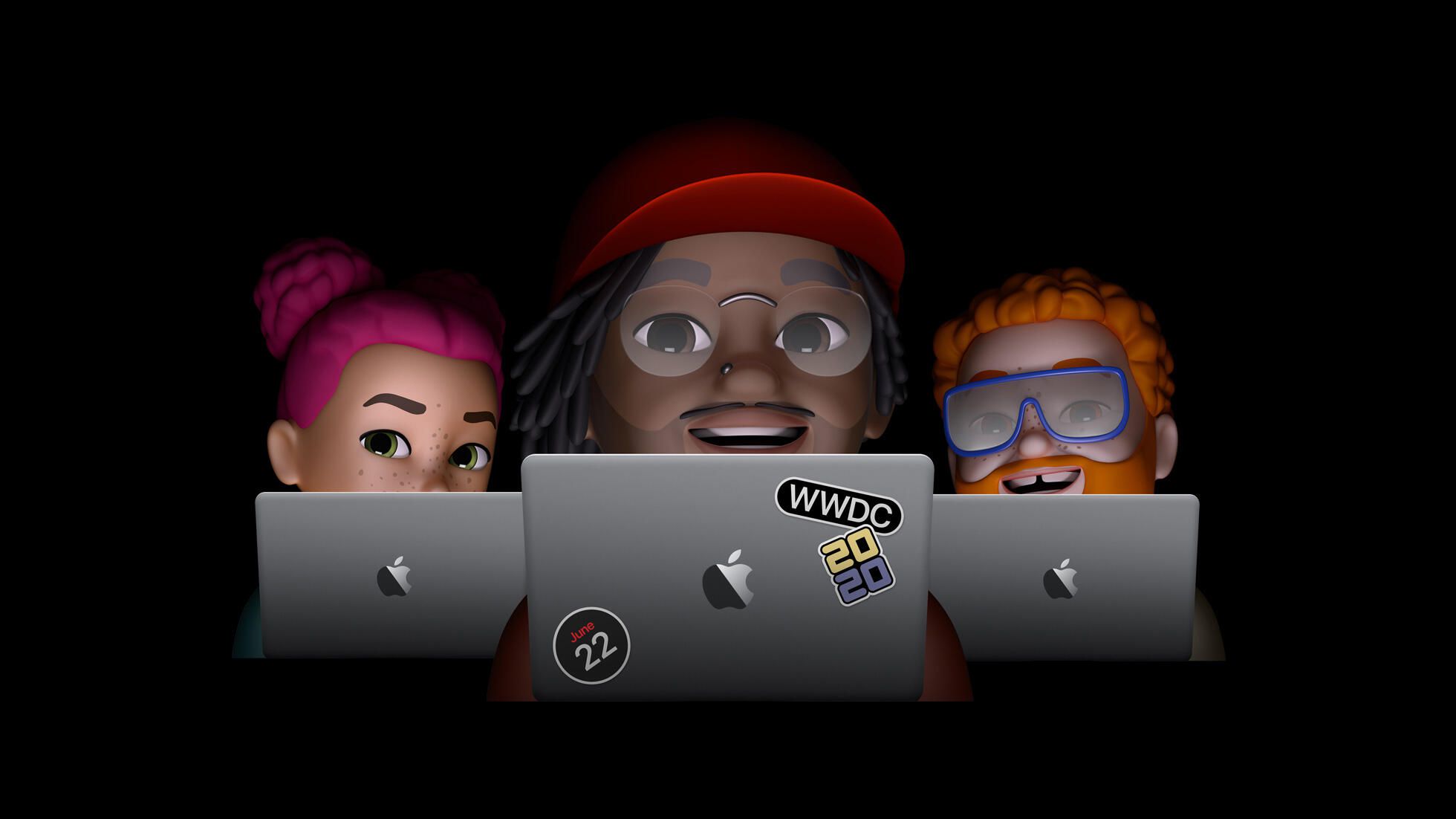
WWDC 2020 Summary

WWDC-2020

Today Apple held the latest developer's conference keynote, for the first time - online. Here are the few key announcements from the conference:

iOS 14

UI:

  • App Library - automatic app organization on the home screen
  • Widgets can be not only on the today screen, but on the home screen, in different sizes
  • Picture in picture - floating videos on home screen

Siri:

  • Siri not blocking the whole screen anymore :)
  • Translate app

iMessage:

  • Pinned conversations
  • New Memojis
  • Inline replies
  • Group conversations improvements

Maps:

  • Guides (what's around / recommendations)
  • Cycling
  • EV routing

CarPlay:

  • Unlock and start 2020 BMW 5 series from an iPhone
  • Use U1 chip to do that from further distances than NFC

App Store:

  • App Clips - fast and lean (<10MB) apps accessible via QR codes / NFC

iPadOS 14

  • Improved photos app
  • Sidebars, top toolbar controls (hello Finder)
  • Improved iPad apps layout
  • No more full screen blocking calls, on iPhone as well (only the incoming call notification or during the call as well?)
  • Mac-like global floating search everywhere
  • Scribble (handwriting recognition)
  • Change default mail and browser apps

AirPods

  • Automatic switching
  • Spacial audio

watchOS 7:

  • Rich complications
  • Watch face sharing
  • Better navigation directions
  • New workout modes
  • Sleep tracking and winddown mode
  • Hand washing detection

Privacy:

  • Upgrade other accounts to Sign in with Apple
  • Approx. GPS location
  • Camera/microphone usage indicator
  • Data usage disclosure in the App Store
  • Safe home devices

HomeKit:

  • Automized routines
  • Easier setup of new devices
  • Adaptive lighting for smart bulbs
  • Extended smart cameras setup

tvOS 14:

  • Show those smart cameras on the TV
  • Multi user support for gaming
  • Picture in picture
  • 4k AirPlay
  • New TV show announcement :)

macOS (Big Sur):

  • New UI and icons
  • Control center
  • Widgets, notifications center
  • Improvements to Messages
  • Improved Maps.app
  • More capabilities in Mac Catalyst

Safari:

  • Privacy reports
  • Customizations
  • Safe extensions
  • Tracker prevention
  • Built-in translation

Apple silicon:

  • Universal binaries
  • Rosetta 2 emulation
  • Virtualization
  • App Store apps support
  • Developer Kit based on Mac Mini
  • 2 years transition, new hardware this year

New Samsung phones impressions

Few weeks ago I jumped into the Samsung Store to see the recently presented S20 (don't care about the +), S20 Ultra and Z Flip as well as maybe, just maybe have a glimpse on the Fold, released almost a year ago!

The S20 is nice, and despite the renewed cameras and updated design I was mostly interested in the improved display, which now supported 120Hz refresh rate albeit on a lower screen resolution. In short: those 120Hz look fabulous, not sure why Samsung has the higher resolution 60Hz mode by default though. You can't see the difference between 1440p and 1080p, but the difference between 60 and 120 Hz is much more noticeable. The hogher refresh rate looks so smooth that I now want to have it on my daily phone as well. Too bad Samsung's software is far from that screen smoothness - I've experienced stutters in their stock Camera, Photos apps..

Enough with the S20. Fast forward to yesterday when I was passing their store again, I noticed they added something new for display.

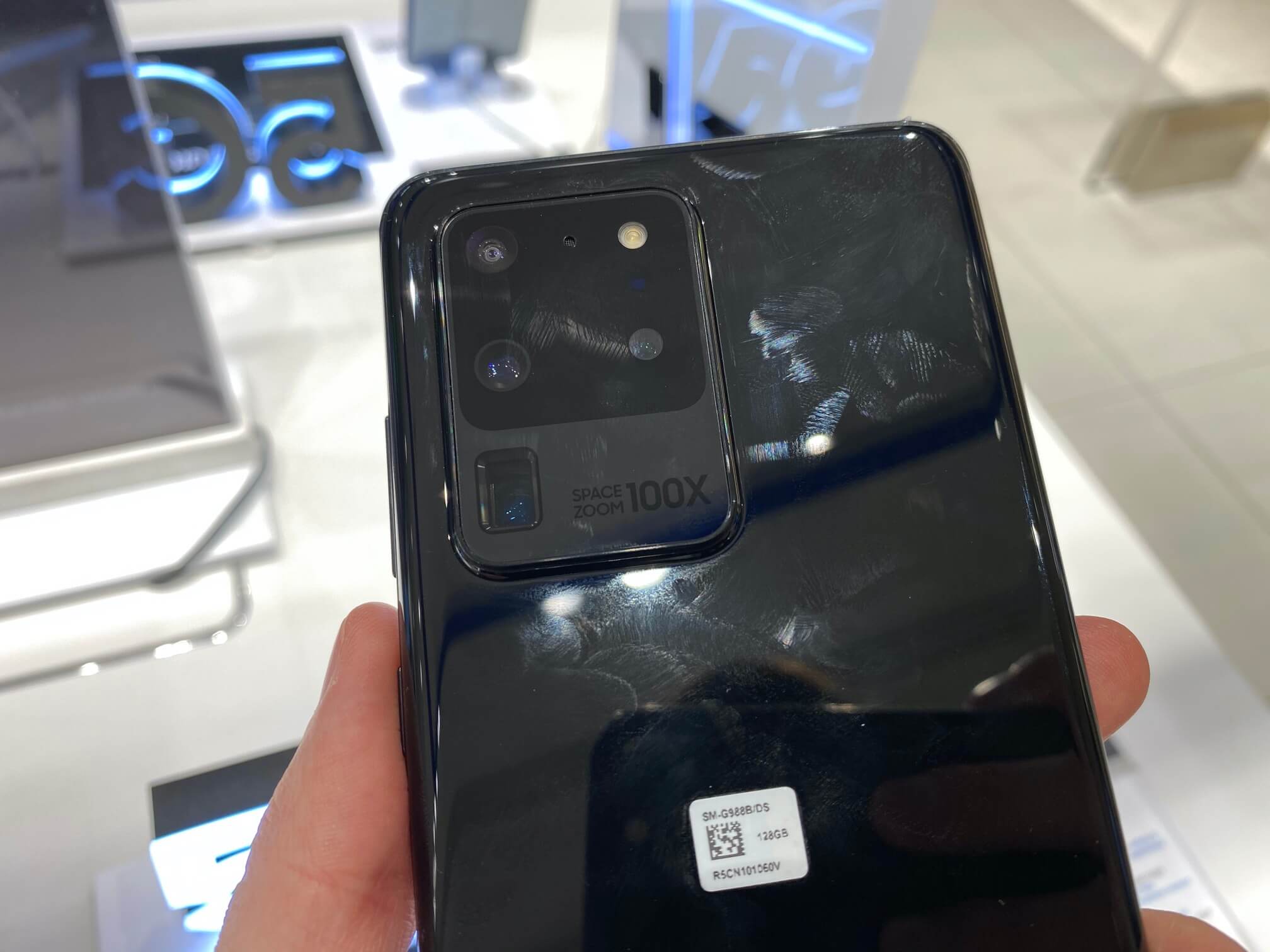
First I saw the S20 Ultra with its Ultra-sized camera bump:
Ultra-bump

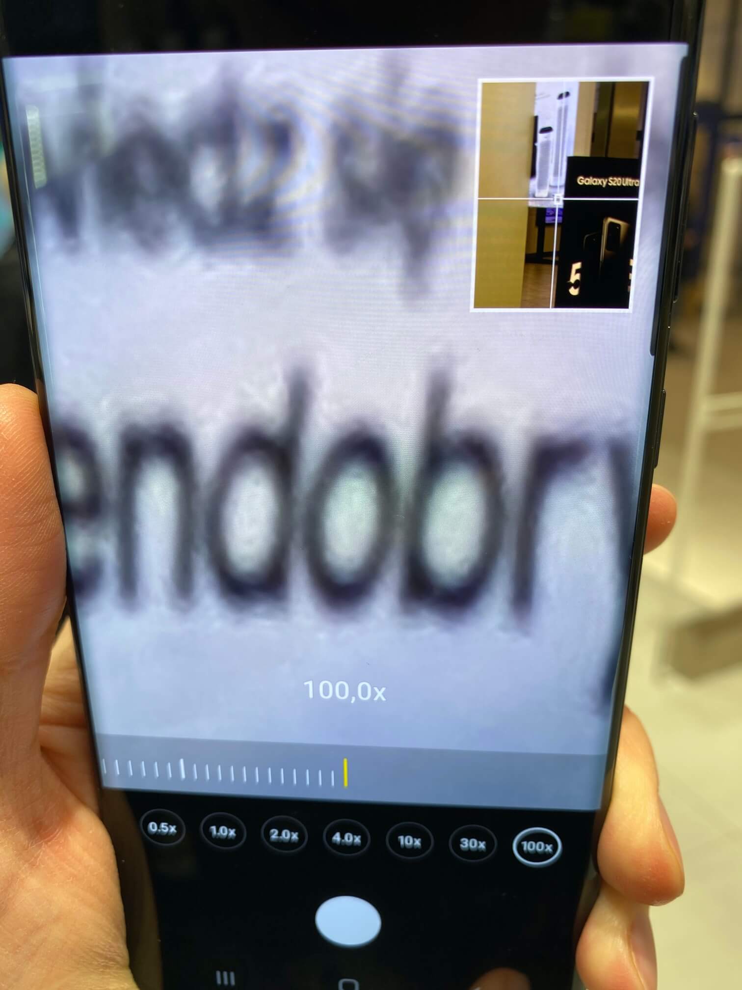
Immediately I tried the advertised 100x zoom just to realize that it's not that great and no magic's happening:
100x-zoom

Other than the bigger camera bump, a bit better specs, battery and size, the S20 Ultra is no much different to the regular S20 and S20+.

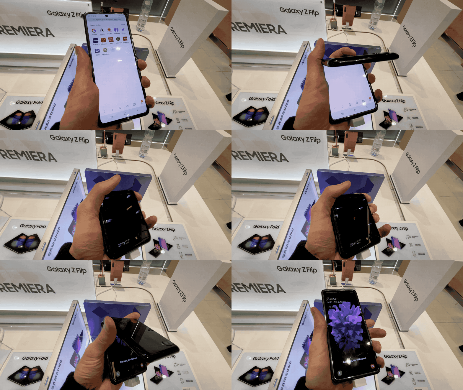
Next what I noticed was the new Z Flip, laying there, open for use! I grabbed it and of course started folding/unfolding it immediately:
Z-Flip

First bending a screen felt very weird, In a second or two it felt so natural like if I would have done it for a long time now. And it felt cool, something phones didn't feel for a while.

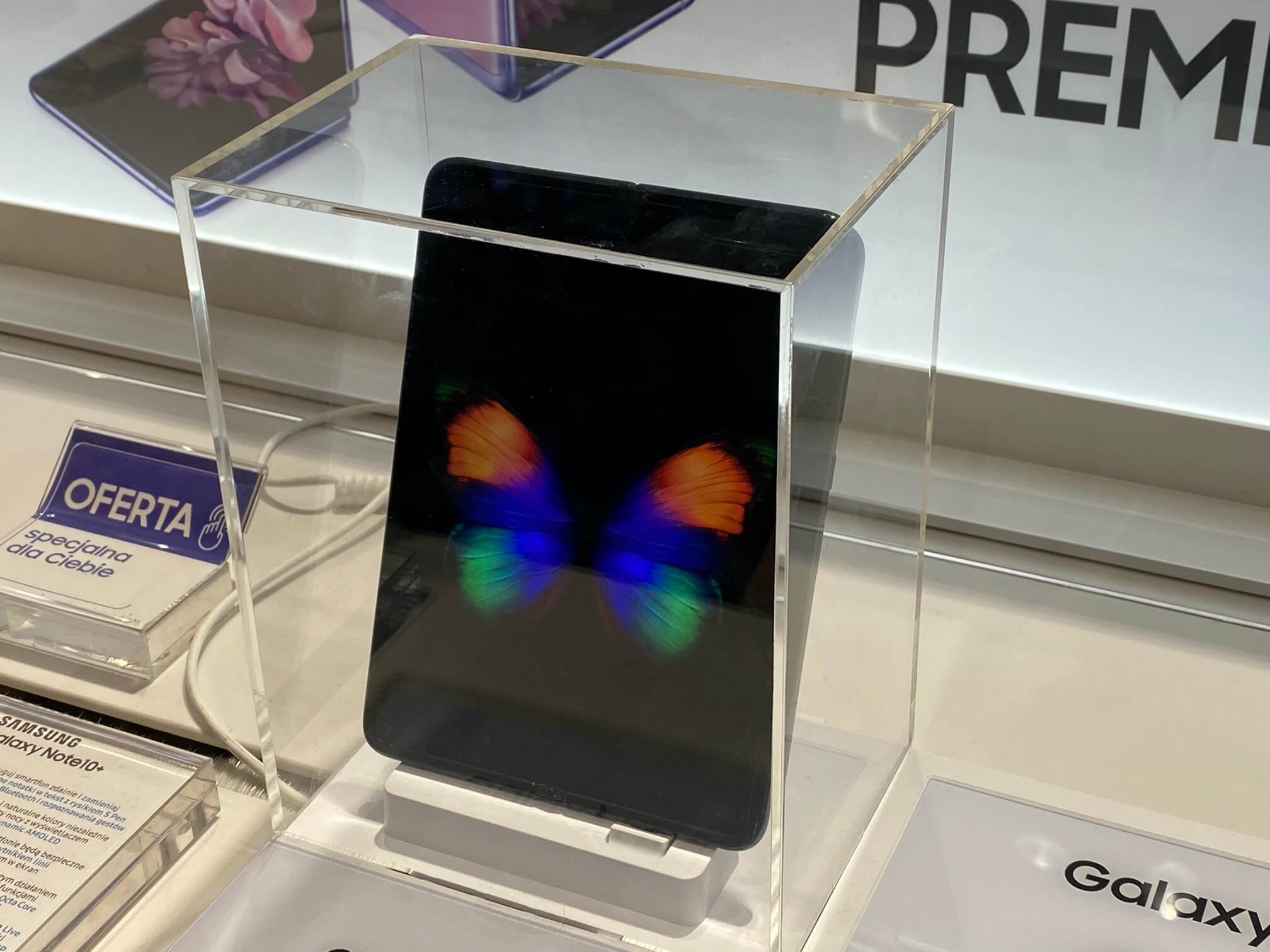
I overheard the salesman telling other customers that both the Z Flip and the Fold are pre-ordered for months, despite being one of the most expensive phones on the market, which means folding phones are hot, ignoring their immaturity and downsides, and downsides there is. As mentioned by many, the Z Flip is unusable while folded, because the tiny screen fits only notifications and for every operation, unlike the Fold you have to unfold it. Also the screens, they are delicate. Very. From what I've been told, the Z Flip has been on display only for a single day, and it already had scratches from fingernails all over the display. But the screen itself actually looked quite well, the crease was not that visible, although I definitely felt it while moving my thumb across it. The tactile feel of moving your finger around this plastic-y screen is very close to glass. But its long-term durability is still under question, that's probably why the Fold is kept in a glass cube for now..
100x-zoom

Also I really liked the feeling of the Z Flip's hinge - it feels sturdy and solid and stops at many angles. Maybe for now folding a phone doesn't have a lot of practical sense all the time, but it definitely feels cool and novel doing it. It would be interesting to see what the competitors, with more polished software will bring to the table, especially when the technology matures, the screen will be less delicate and cheaper to manufacture, overall bringing the currently high price down. I'm actually looking forward to a future like this.

Microsoft Fluent Design overview

Microsoft-Fluent-Design

The recently announced news about Microsoft's Fluent Design (FD) are pretty scarce, so I had to look into their official docs to understand what's FD all about.

Previously Microsoft created a visual framework which they used for web and Windows apps internally which then they expanded and are now sharing with the global audience. The most noteworthy use of FD is apparently Microsoft Office's apps for mobile.

The problem (except the framework's name Fabric, I thought they bought Twitter's and then Google's crash reporting system, ugh) is that this is just a UI framework, like the unofficial material design (not by Google who created Material design) UI framework for iOS.

FD is NOT a cross-platform runtime framework like React Native (written with ReactJS) or Flutter (written in Dart), but it's just a UI framework for iOS (written in Swift) and Android (Kotlin) which you can use in your apps.

So if you're a fan of Microsoft's buttons or their pickers you can go for it, but since most of current apps are using either stock iOS or Android UI elements or some own custom designs instead, I can't see much use of FD just yet.

Also currently their github repo has only a single issue with a question about FD's roadmap which is now unanswered. Maybe the answer will provide any notable information on the future of the framework but at least for now it's really hard to evaluate its worth, especially at this early stage.

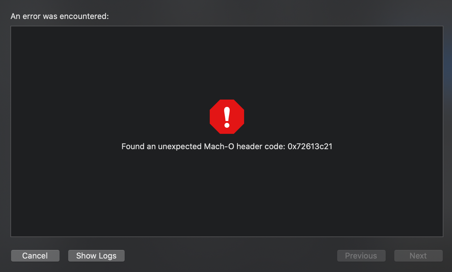
Found an unexpected Mach-O header code: 0x72613c21 (Carthage)

Mach-O

If you ended up here, know that this was a tough one πŸ™‚

If you're using Carthage and already cleaned all the embedded frameworks and "Copy Bundle Resources", cleaned the project and removed Derived Data, and none of your verbose logs were helpful, here's what helped me:

It turns out you put only static libraries into your input.xcfilelist and output.xcfilelist files. My problem was that somehow I added there a recent Firebase's dependency - the AppAuth.framework thinking it's neccessary to be stripped down before uploading to the App Store. Turns out its not and removing it from the aforementioned files actually solved the issue.

P.S. This helpful SO post explains how to understand which of your libraries are static and which are dynamic.

Apple Keynote September 2019

Apple Keynote September 2019

What was revealed today:

Services

Apple arcade

  • Console-level games (didn't look like it)
  • Launches sept 19 with limited amount of games
  • $4.99 / mo / family
  • Best (presented) games looks very basic, but the price is cheap, so...

Apple TV+

  • 'See' movie trailer
  • 12 show title on big screen - all new / unknown
  • 1 month free trial
  • 1st show launches Nov 1
  • $4.99 / mo / family
  • Apple TV+ free for 1 year for each new purchased device

Hardware

iPad

  • New budget iPad with smart connector to support keyboard and apple pencil
  • $329 regular, $299 for education
  • 100% recycled aluminium

Apple watch

Saves / improves people’s lives
Participates in health research

Series 5:
  • Always on display
  • Compass
  • International emergency calling (LTE models)
  • 100% recycled aluminium
  • New titanium, ceramic materials
  • New Nike and Hermes models
  • $399 for the GPS, $499 for cellular models
  • Available Sep 20
  • Series 3 price down to $199

iPhone

Budget iPhone (formerly known as XR) is now called iPhone 11, and the successor for XS and XS Max are called 11 Pro and 11 Pro Max

iPhone 11

  • 6 colors
  • Dolby Atmos support
  • Dual camera (wide 1x and ultra-wide camera)
  • Night mode
  • Improved front-facing camera
  • New A13 bionic chip
  • Chinese company showing a GPU performance demo with their game demo
  • 1h longer battery than on XR
  • Wireless charging (XR also has it)
  • Wi-Fi 6
  • $699 starting price (nice)

iPhone 11 Pro

  • Everything iPhone 11 has plus:
  • New matte finish
  • New midnight green color (yikes)
  • Up to 1200 nit brightness
  • A13 improvements: Machine Learning, Low-Power design
  • 6x faster matrix multiplication for ML, over 1 TFLOPs
  • CPU cores are up to 20% faster and 30-40% lower power
  • 4-5h longer battery (nice)
  • 18W charger in the box
    New camera system (updated wide + telephoto and a new ultra-wide) - looks like a triclop 😏
  • Simultaneous video recording from multiple lenses in pro apps
  • Starts at $999 and $1099 for the bigger iPhone 11 Pro Max

Apple Retail(?)

  • Custom Apple watch bands
  • Trade in
  • Fifth Avenue store reopening

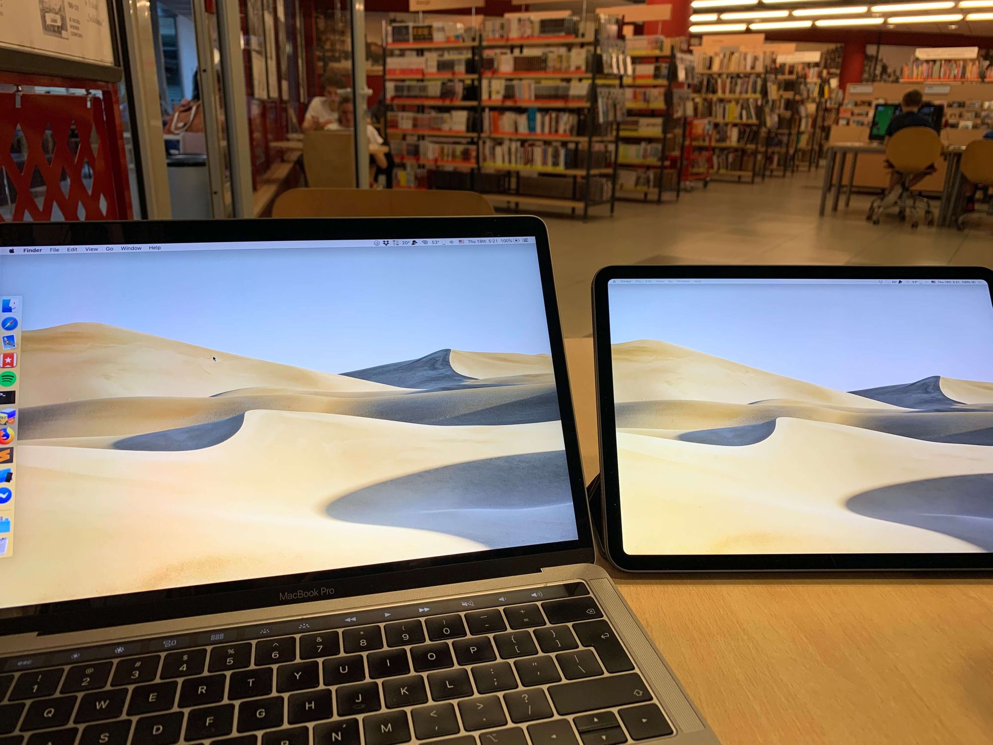
Sidecar vs Duet Display

Sidecar-vs-Duet-Display.jpg

While working at home I have a 27" screen attached to my laptop. That's why when I'm working outside home I'm left with much smaller screen real estate and it's really nice to add at least some of it with an iPad.

I'm using Duet Display probably for few years now, but at the recent WWDC Apple announced Sidecar - using your iPad as a secondary monitor, wirelessly.

I tried it on the Mac OS Catalina beta along with my iPad running iPadOS 13 beta but still returned (at least for now) back to Duet Display.

Here's my take on advantages and disadvantages of Sidecar in comparison to Duet Display.

Pros:

  • Works wirelessly (who needs wires anyway πŸ™‚)
  • Can be enabled with one click
  • No 3rd party installation required
  • First party solution - so works flawlessly (ignoring early Beta software bugs)
  • Doesn't drain your Mac's battery if you're on it
  • Touch-bar controls (if you're into that)
  • Free

Cons:

  • No touch events are passed - in Duet Display you can tap the screen and it would register them as mouse clicks. In sidecar this behavior is disabled. With Duet display you can draw with your finger or Apple Pencil right in Mac OS if needed (to sign documents, etc.) and with Duet Display Air and Pro extra purchases you get even more Apple Pencil functionality, transforming your iPad back into a tablet πŸ™‚ (not the entertainment device as it is but as a drawing Wacom-like tablet). Not a big deal for me personally, but decided to share
  • Resolution - and this is a big one for me. Sidecar provides less resolution (probably because wireless transmission bandwidth is limited) than Duet Display, thus the iPad fits less info, granted the info it fits is much bigger physically which can help reading smaller texts from far

So overall, Sidecar is a nice general-purpose feature which is free and easy to use. But at least for now the main issue for me is the lower resolution operation which leaves not enough physical space to put all the secondary (by value) apps onto the secondary screen. That may change, but for now I'll stick with Duet Display.